When it comes to website design, one of the more important decisions you’ll make involves choosing the right colors. It’s a choice that can make or break your project, especially when you consider all the moving parts that go into creating a successful website.
Nowadays, chances are good that if own a website, you own a business as well. And the most important thing for a business website is to have a good conversion rate. If your website isn’t converting, your company might as well hang up a “Closed for Business” banner.
That’s why it’s important your website’s color scheme is planned, intentional – and most importantly – optimized for conversion.
In this article, we’ll take a look at how colors influence our lives and how they can be used to improve how your potential customers or clients perceive your site and brand.
Why is Color So Important?
Color plays an important role in our everyday lives. It connects to our feelings in a unique way, making it a powerful marketing tool to harness when making design decisions. Your color choices need to reflect the message you want to share about your upcoming event or product. Usually, color is the first thing that will draw the eye and visually guide your visitors, which is why it’s important that the colors in your design are purposeful and have meaning in their use.
According to a Kissmetric’s infographic, 85% of shoppers base their decision on color alone. And according to the same infographic, proper use of color leads to an 80% increase in brand recognition.
Various other studies and tests have proven that color can increase memory, engage and increase participation, as well as inform.
If you take a deeper look at the infographic mentioned above, you can see that Kissmetrics suggests which colors you should use depending on the nature of your business. It would be easy to assume then that if you are a clothing store you should settle on a pink color scheme. But the decision-making process is not clear-cut and definitive answers don’t exist. I realize that’s not very helpful. But let’s take a look at how color theory works to glean a bit more info about how to land on the right color for your next site.
Color Theory
Color theory is a topic so broad and diverse that numerous books have been written about it. So we’ll stick to the basics here. Essentially, color theory can be broken down into three major parts as it refers to web design:
- Contrast. In layman’s terms, contrast is the difference between two colors. Contrast serves two functions in web design: it establishes readability as well as draws the viewer’s attention towards a specific element on the page. Whenever you are in doubt, the best practice is to choose a very light color for the background and a very dark color for the text itself.
- Complementation. Complementary colors are found opposite each other on the color wheel. For example, red’s complementary color is green and blue’s complement is orange. When used correctly, these colors can accent each other and make a very effective color scheme.
- Vibrancy. This refers to the general mood particular color sets: the brighter, warmer colors (red, orange, yellow) tend to energize us while darker, cooler shades (green, blue, purple) tend to be more relaxing and tranquil.
Color Meanings and Culture
Colors have different meanings across different cultures. The way we perceive a certain color may not be the same as someone from Japan or the Middle East. When planning a website, it’s important to understand who your target audience is and how that particular culture views color associations. Web Designer Depot has a great breakdown of colors and their meanings cross-culturally. I’ve summarized them here:
Red
- In western cultures, such as North America and Europe, red is the color of passion and excitement. It symbolizes danger, love, excitement, and power but it can also carry a negative connotation when connected to the countries that used to belong to the Eastern communist block.
- In Eastern and Asian cultures, red represents happiness, joy, and celebration; and as such it is often worn by brides on their wedding day because it is thought to bring good luck and happiness.
- In the Middle East, red represents danger and caution. Some also consider it the color of evil.
Orange
- The West sees orange as the color of harvest and autumn. Traditionally, in the United States orange signifies the fall season beginning in September through to Halloween and then Thanksgiving in late November.
- Indian cultures consider orange a sacred color while in Japan, orange symbolizes courage and love.
- Finally, the Middle East associates orange with mourning and loss.
Yellow
- In Western cultures, yellow is associated with warmth, summer, and hospitality. Oddly enough, in Germany, yellow is associated with envy whereas most of the rest of the world associates this feeling with the color green.
- In Eastern and Asian cultures, yellow is not only considered sacred but imperial as well. In India, it symbolizes commerce.
- Contrary to that, in Latin America and Egypt, yellow is associated with death and mourning. The rest of the Middle Eastern cultures view yellow as the color of happiness and prosperity.
Blue
- Many Western cultures use blue for bank logos because it represents trust and authority. It’s also associated with the birth of baby boys and considered to be calming, soothing, and peaceful. In a negative context, it represents sadness and depression.
- In Eastern and Asian cultures, blue is associated with immortality and strength. Contrary to the western world, blue is a feminine color in China.
- In Latin America, blue is often associated with religion due to the high presence of the Catholic church.
- The Middle East sees blue as safe and protecting as it is the color associated with Heaven, spirituality, and immortality.
Green
- While Western cultures associate green predominantly as the color of the Irish and luck, green also refers to nature, the environment, the protection of environmental causes, and progress. In a negative context green symbolizes envy or jealousy.
- In Eastern and Asian cultures, green is the color of nature, fertility, and youth. However, it’s also associated with infidelity and exorcism.
- In Latin America green is the color of death.
- For the majority of the Middle East green represents strength, fertility, luck, and wealth and is most commonly associated with Islam.
Purple
- In Western cultures, as well as most Eastern and Asian cultures, purple is the color of royalty and is associated with wealth and fame.
- On the other hand, Latin America and Thailand see purple as the color of mourning and death.
- The Middle East sees purple as symbolic for wealth.
Pink
- In Western cultures, pink is the color of femininity and signifies the birth of a daughter. It also represents sweetness, childhood, or fun.
- In Eastern and Asian cultures, pink is also considered feminine where it also signifies marriage. The exception is China which, as stated above, sees blue as the feminine color.
- In Latin America, pink is often used as a color for buildings, while the Middle East doesn’t tie pink with anything in particular.
Brown
- Western cultures associate brown with the earth but also health or even barrenness. Brown is stable, dependable, and wholesome.
- In Eastern and Asian cultures brown is the color of mourning while in Latin America brown discourages sales and is generally considered disapproving.
- Middle Eastern cultures associate brown with the earth and comfort.
Black
- The Western world sees black as the color of finality, death, formality, and mourning, as well as the color of control and force.
- In eastern and Asian cultures, black represents masculinity and is the color for boys in China. It also symbolizes wealth, health, and prosperity, while in Thailand and Tibet, black is most closely associated with evil.
- Like in the East, Latin America associates this color with masculinity and mourning.
- Interestingly enough, Middle East uses black to symbolize both rebirth and mourning.
White
- In Western cultures, white is the color of purity and peace. It is the color associated with weddings, hospitals, and holiness.
- However, in Italy and Eastern and Asian cultures, white is used for funerals and represents sterility, mourning, unhappiness, and misfortune.
- In Latin America, white has many of the same associations as in North America and is connected to purity and peace.
- Similarly to black, the Middle East associates both purity and mourning with white.
Color and the Conversion Funnel
A conversion funnel helps you visualize and understand the flow your potential customers go through after they land on your website and take the desired action. In its most basic form, the conversion funnel has four main elements: awareness, interest, desire, and conversion. Let’s break them down:
Awareness
Awareness is all about attracting potential customers or clients to your site. This is the part of the funnel where they get introduced to your brand. They get familiar with your business, your company culture, and your mission statement. This is where colors start to play a major role. By knowing who your target audience is and knowing the emotions you want to evoke, you can start planning your overall color scheme.
Interest
At this stage, you are working to pique the interest of your website visitors. You want to guide them to explore further and dive deeper into your website. Your energy should be focused on polishing headlines, images, banners, and writing a compelling copy.
Desire
Now that you have their interest, you have to make them really want your product. Your website’s imagery, great product options, videos, and testimonials should provide all the necessary information that they need in order to take action.
During the website planning stage, you should choose 3 colors that will represent your brand’s website. The general rule of thumb is typically to use neutral colors such as white or black for the background and use your main brand color to create a visually striking effect. Your primary brand color could be used for links, navigation menus and headlines. The third color should be an accent color from your brand palette that will serve one specific purpose. That brings us to the fourth stage of the conversion funnel.
Conversion
This is where the visitors take your desired action or in other words, convert. What that action is, depends entirely on you but the main goal is that they take action. This is where you need to draw their attention to that one single action. The best way to do that? Use the accent color from your color scheme. This is where you want a color that compliments your color scheme but is contrasting enough to draw the eye to your main call-to-action.
In other words, if your website uses mainly blue then it would make little to no sense to make your call-to-action button a darker shade of blue. Using a color like orange or a shade of yellow or red would be more beneficial.
Do, however, make sure your call-to-actions contrast with your brand colors enough to stand out, but not clash. You want it to draw people’s eye, pushing them toward conversion, not scare them off with an unappealing color scheme.
How to Color Optimize Your Website
Now that you know what colors mean and how the conversion funnel works, let’s discuss how to come up with a color scheme for your website that is optimized for conversion.
Planning your website color scheme is an integral part of your conversion strategy. Your personal color preference matters very little in this respect. Before you even embark on that stage, you should bear in mind what the primary goal of your website is and who your target audience is.
Based on your audience, your color scheme will be different if your target audience is female then that of someone whose target audience is teens and young adults.
While you may think that you can’t go wrong with pink if you are targeting women, you might be surprised to find out that roughly 35% of the women prefer blue as their favorite color, followed by green and purple.
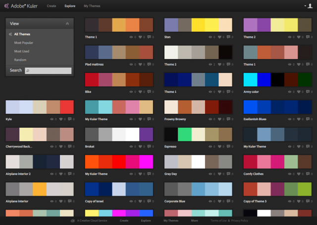
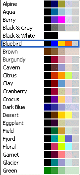
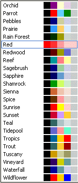
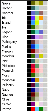
Here are some color swatches to assist you with choosing a theme for your website:


